Objective
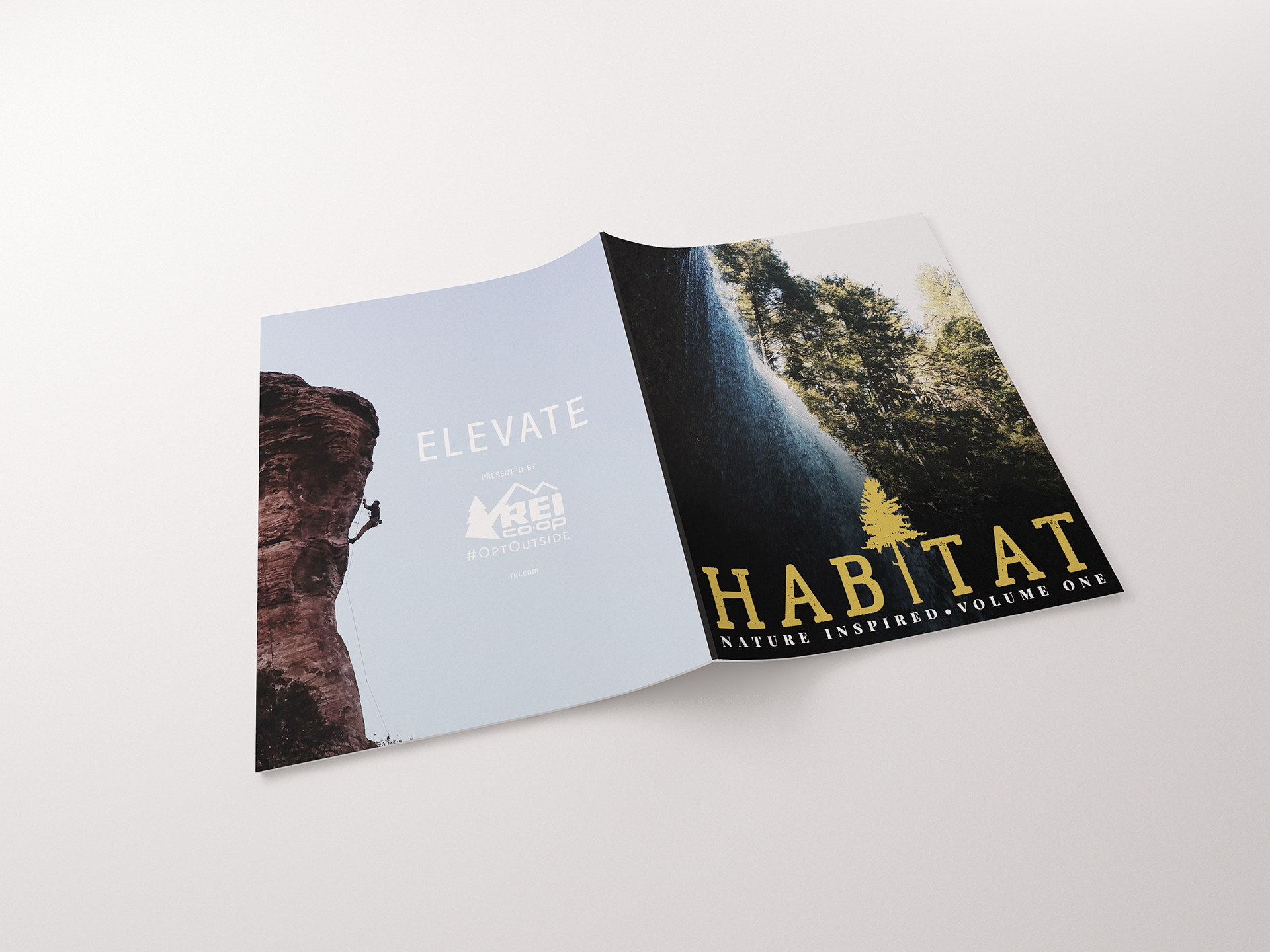
Developed a brand and created a two-spread magazine layout that has continuity in design and content. The primary challenge was to create a fully functional magazine layout that is pleasing to the eyes of the reader, making use of master pages, typefaces, and imagery. The goal was to seamlessly integrate photography and text work together to spark interest and motivation for outdoorsmen and women to get out into nature. Finding imagery that ties this layout together must take thought and vision. The back cover was constructed with an advertisement relating to the content.
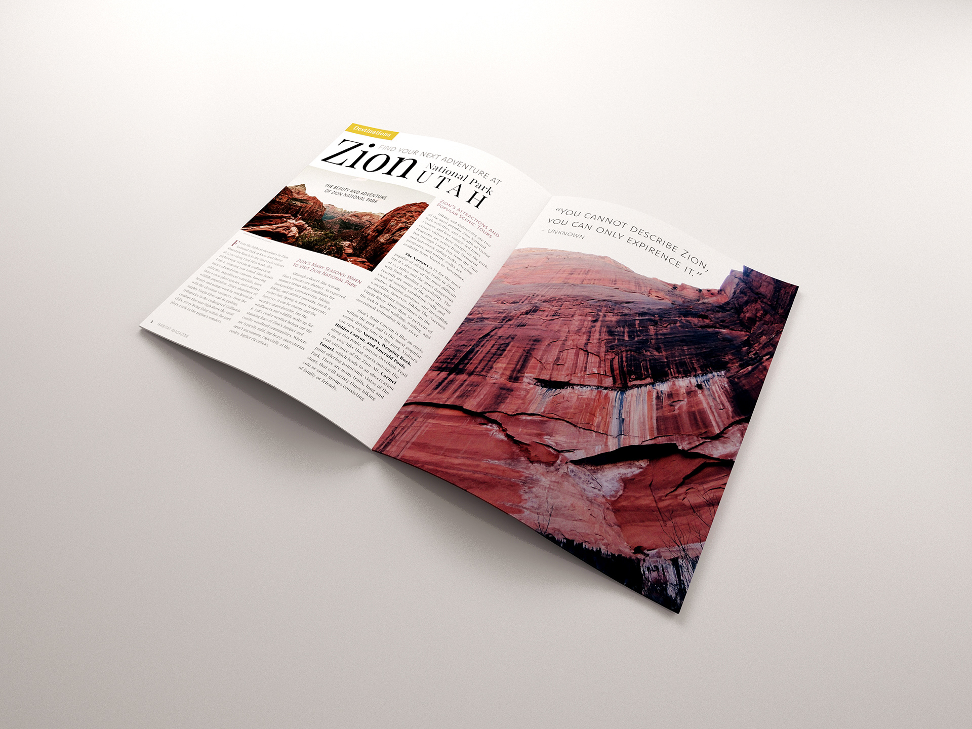
There is a whole world to discover. “Habitat” is the outdoor lover's go-to magazine. The magazine favors imagery and includes vivid photography taken by those who find their peace of mind out in nature. The expected target audience is people who want to find new places to venture, hike, and more. They strive to be in the present moment and take the time to appreciate the beautiful planet they reside on. The annual, Habitat Magazine, was developed to capture the target audience visually. It will include both famous and hidden hiking destinations. The inside spread is geared towards the bright red canyons of Zion National Park. It tells readers about the park and the various trails they can choose to explore.
“
The magazine favors imagery and includes vivid photography taken by those who find their piece of mind out in nature.
The magazine favors imagery and includes vivid photography taken by those who find their piece of mind out in nature.
Exploration
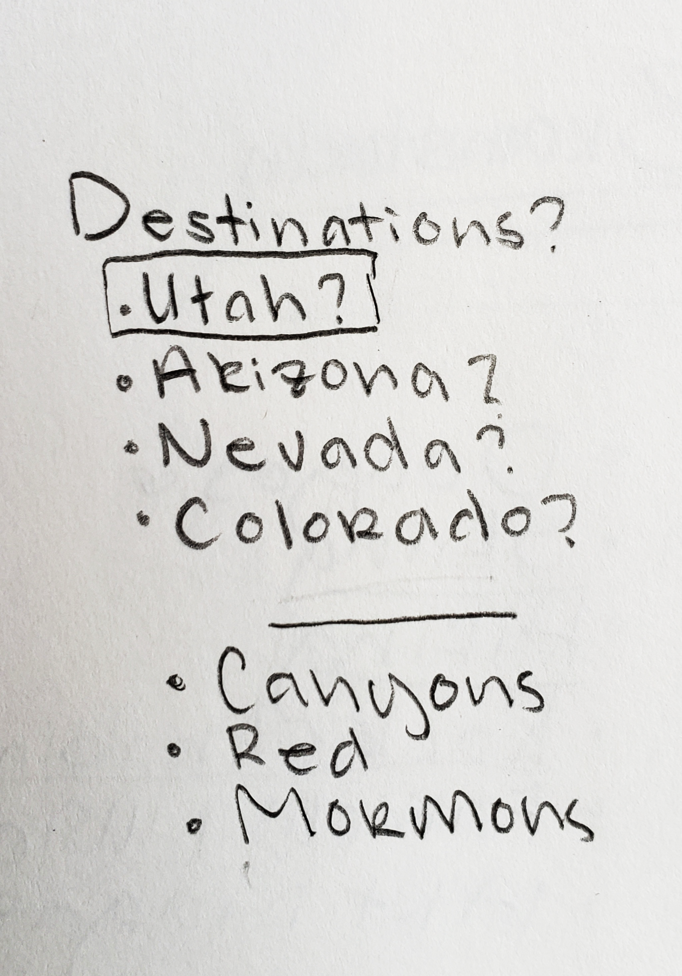
Destinations
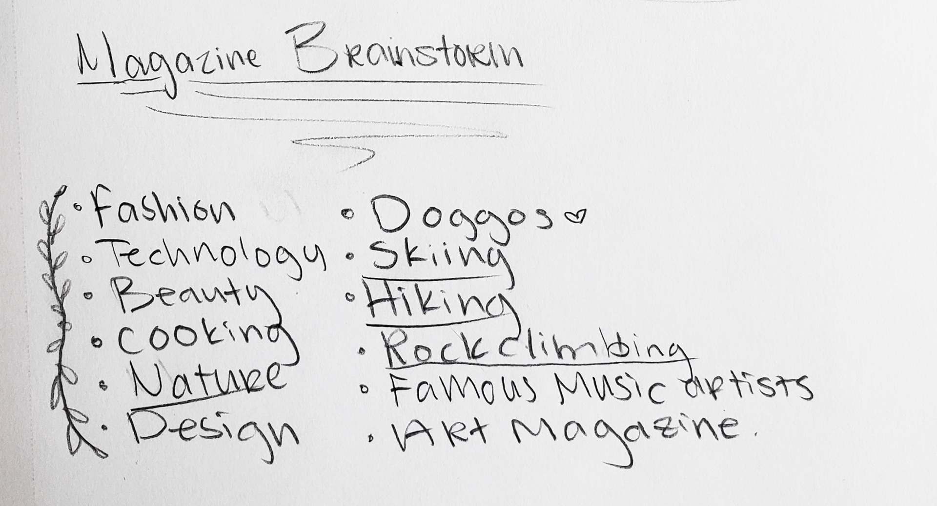
Brainstorming
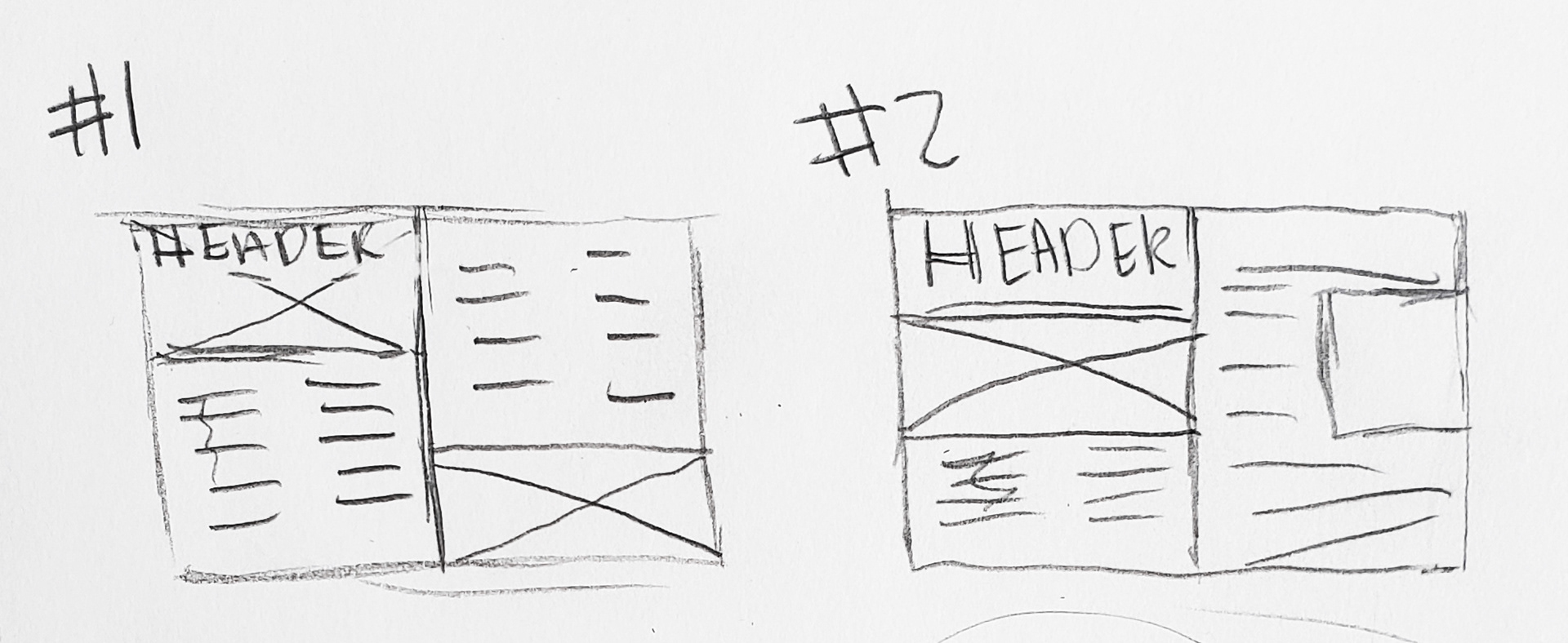
Prototypes
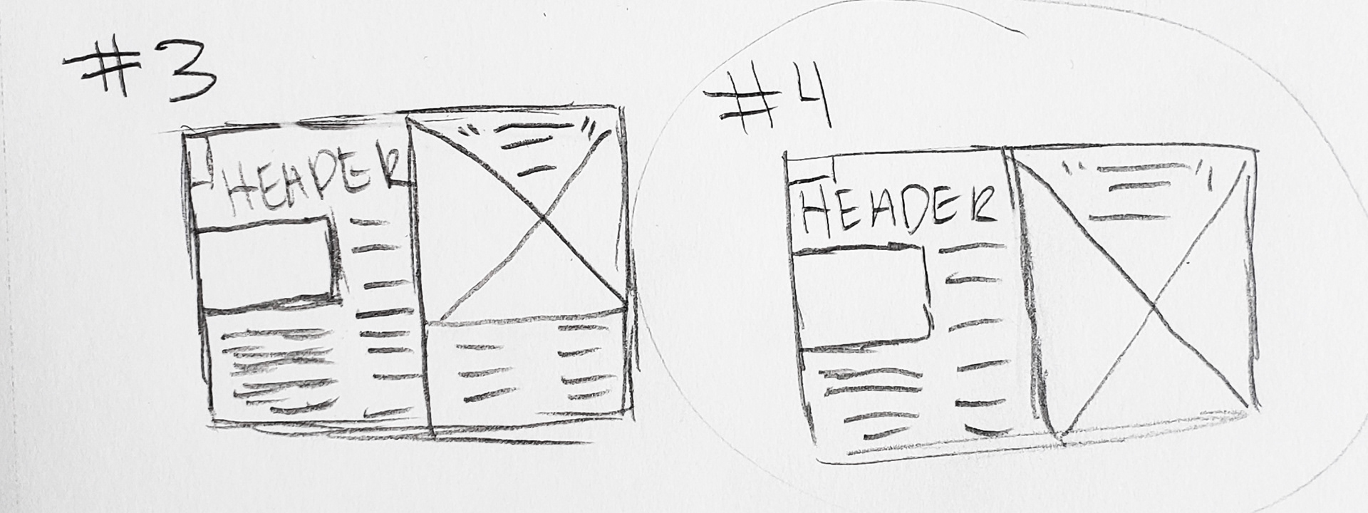
Prototypes
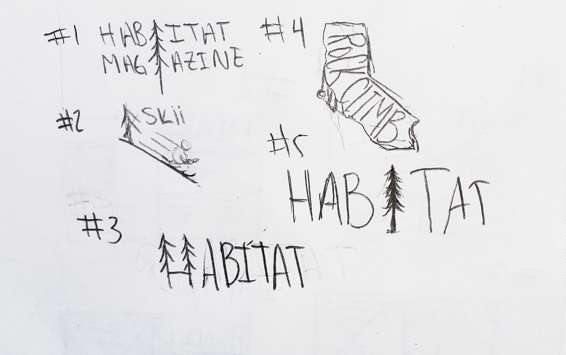
Logo Ideas
Discovery & Ideation
It took some pondering to decide what direction to go for this layout. The process began with brainstorming. Writing down all that came to mind, a list of likely paths was curated. An outdoor theme was apparent within the list, but what to narrow down to was still undecided. Then the process of choosing an outdoor theme began. The idea of a skiing magazine came to mind but decided that it was not the direction to pursue because it would limit the range of content to strictly snow sports. Looking back at photographs from previous hiking trips, inspiration came when coming across photographs of me hiking the Narrows at Zion Nation Park in Utah. Instantly, the magazine was narrowed down to different National Parks in the U.S. and other areas across the globe.
With the subject set in “stone”, the sketching and prototyping process began. Developing a layout that was equally, photograph and text-friendly was pursued. When describing destinations of the world, it would be more successful having more imagery than body copy. The photos were the high focus point, and the chosen text was used to illuminate the photography and educate the reader on the selected hiking destination.
Inspiration
Solution
Experiencing Zion Nation Park first-hand helped with the inspiration and overall development of this project. The memories made at this destination allowed me to understand the beauty of the park. This magazine is a call toward those who are looking for a place to explore. The imagery was a considerable part of this project and successfully conveyed the message. The cover page is set apart from the rest of the spread gives the eyes a visual break from the red canyons on the next page and the back cover. The tree replaced the “I” in the Habitat logo to symbolize nature and pull the magazine together.
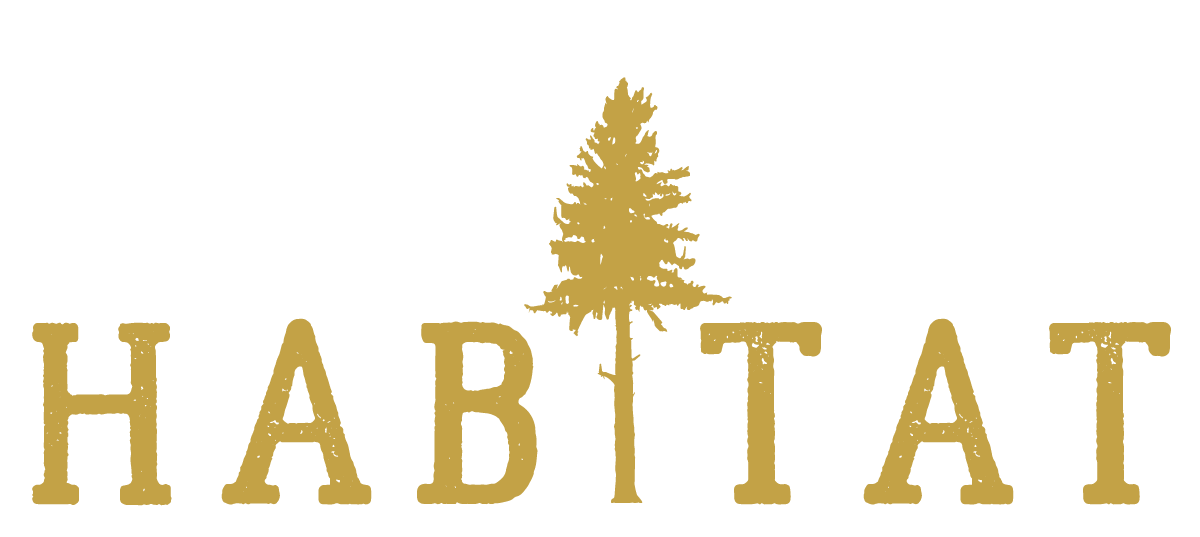
Habitat Magazine Logo
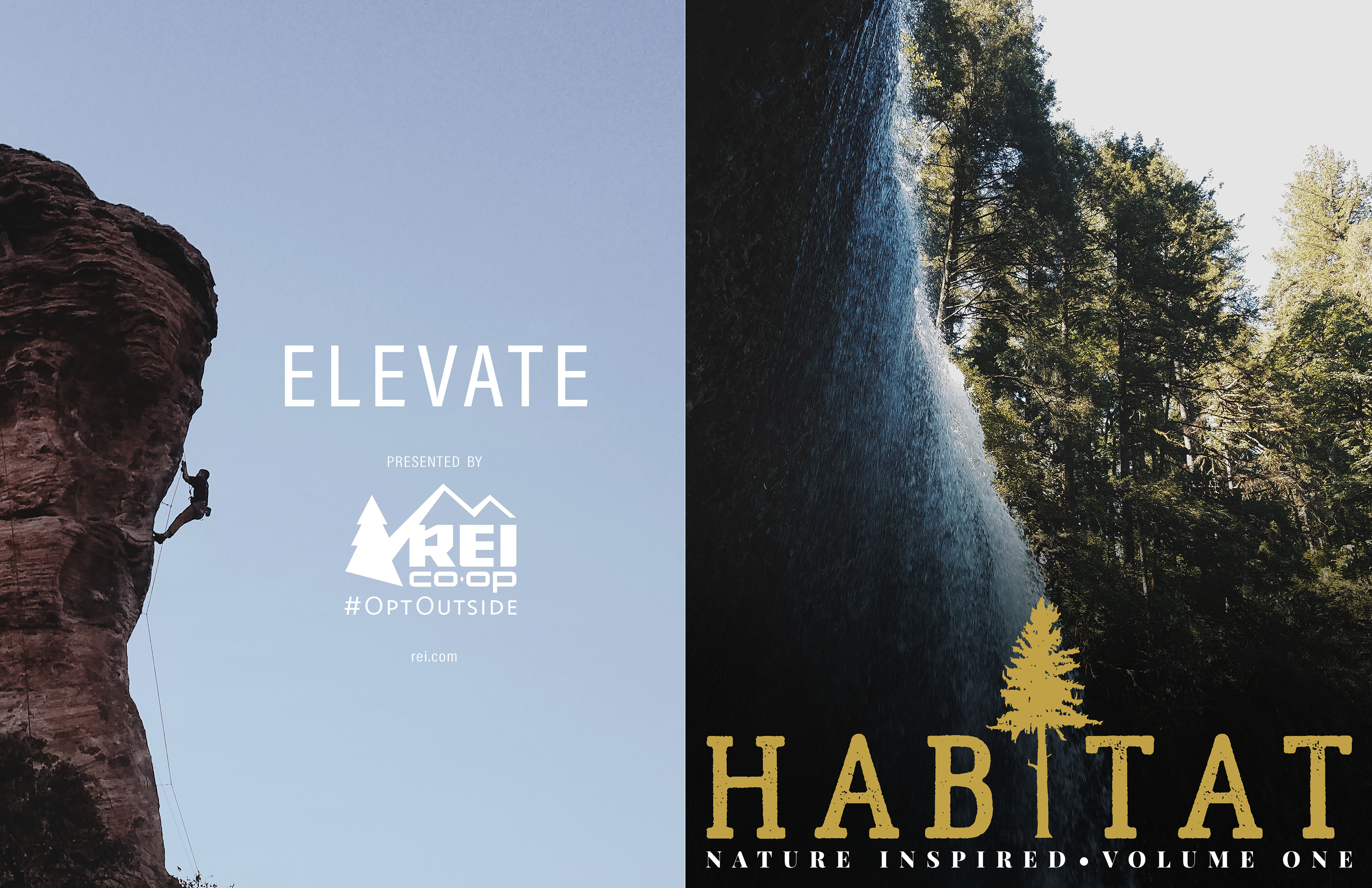
Front and Back Cover
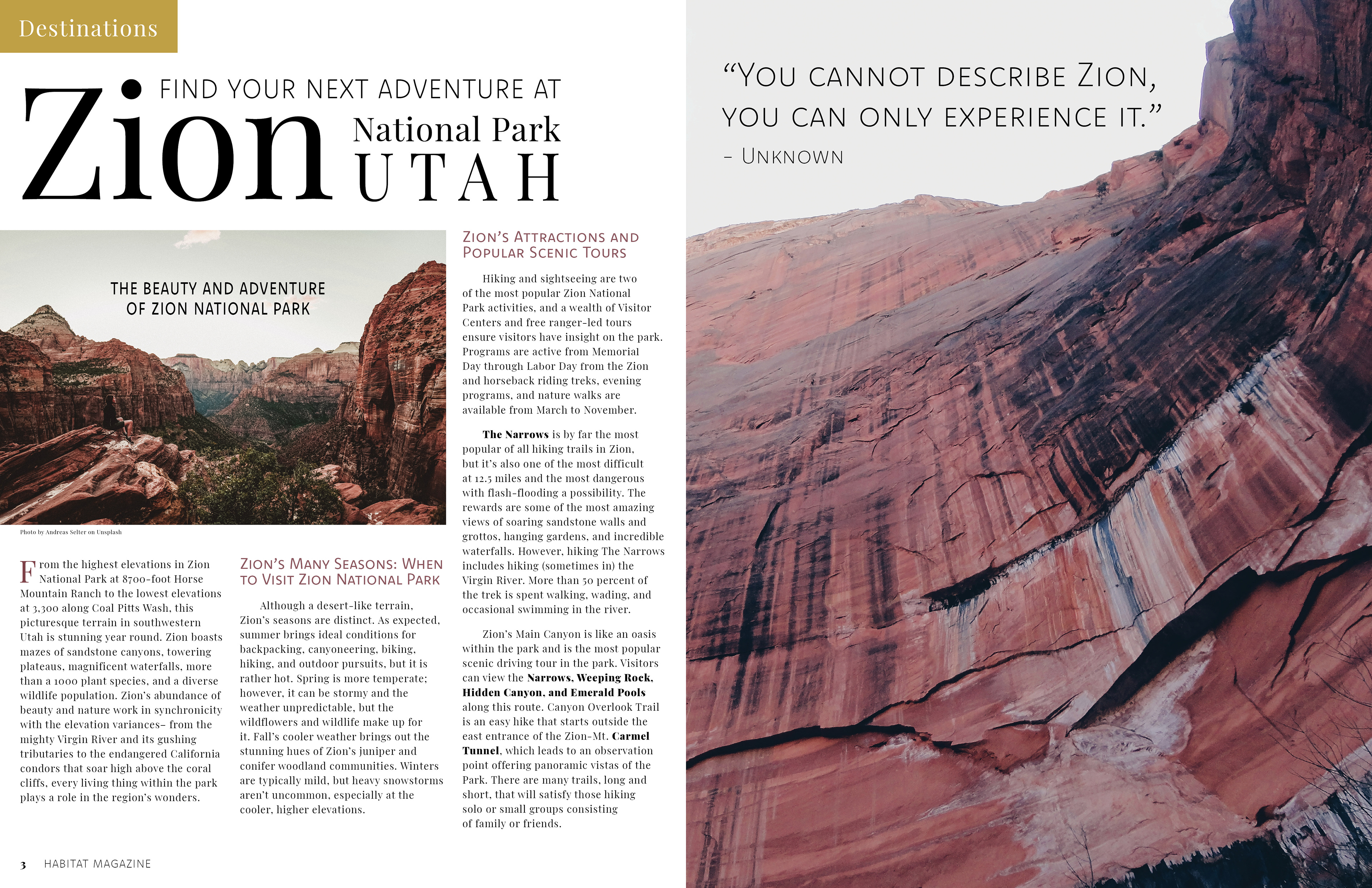
Inside Spread / Editorial
Challenges
The challenges were predominantly technical. The ability to play around with the body text and to work with the more prominent elements took time and calculation. Many rough drafts were printed only to find that the writing was too big or too small, or the hierarchy was not visible. Manipulating the header of the article made for a more exciting layout. It was a challenge, but was also an enjoyable learning experience, and sparked a higher appreciation for typography. Balancing aesthetics was also a practice of patience. Finding photographs and adjusting to the same tone unified all the images.
Conclusion
This project, although time-consuming, was delightful once getting into the swing of things. The beginning of a project is always a little slow, but then as I continued working, ideas and visions began endlessly flowing out of my brain. Experimenting with color and typography was satisfying and pleasing to the eye and reflecting on my past experiences out in nature made this project very reminiscent and memorable. When allowed to choose the desired theme for a project, it is essential and recommended to go with something that you thoroughly enjoy. This project sparked my love for layout design and paved a more precise path in what I would like to focus on in the design industry.
