Objective
In the city of Cologne, Germany, you can find, Museum Ludwig. Museum Ludwig was founded in 1976 and is now the home of contemporary art. The goal was to curate an 8-page, broadside brochure for Museum Ludwig. The pamphlet includes photographs of both the inside and outside architecture, available exhibits, opening hours, ticket prices, and where to locate the museum. Overall design choices must follow the guidelines of the museum. In this case, with no style guide provided, it left room for creative experimentation.
Selected images represent the museum accurately and be cited appropriately and double-checked for creative commons and other copyright issues. If a passerby were to search a brochure box, this brochure would catch the reader’s attention and have them reach for it. Readers may find all the information they need to visit this beautiful and minimalist museum inside. Reading through the content is a breeze with design elements made to help lead the reader to the next section of information.
“
This brochure is to catch the reader’s
attention and have them reach for it.
This brochure is to catch the reader’s
attention and have them reach for it.
Exploration
Contents
Prototype No.1
Prototype #2
Prototype #3
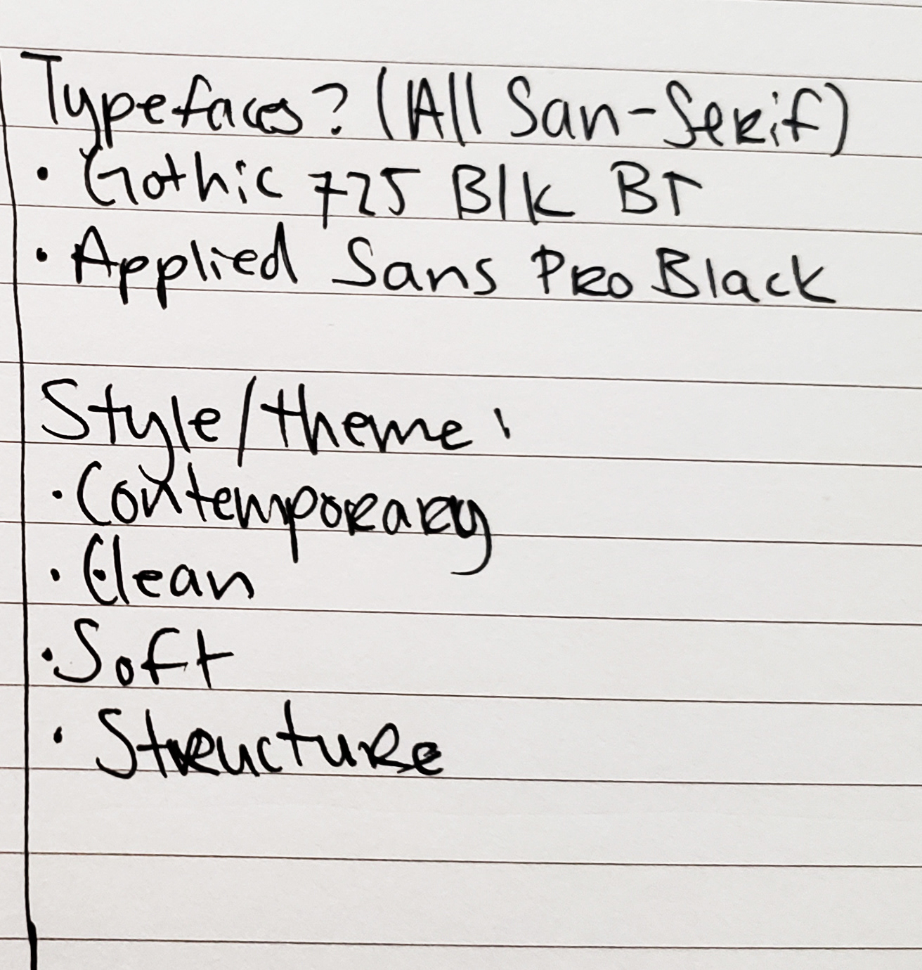
Theme Ideas
Discovery & Ideation
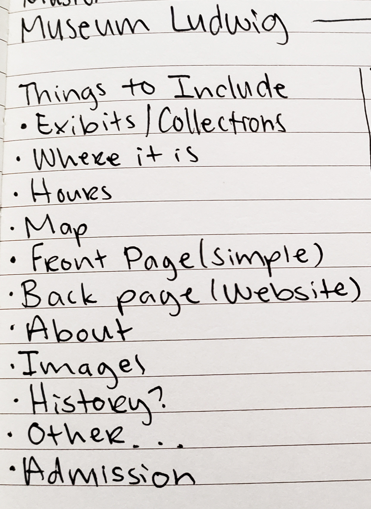
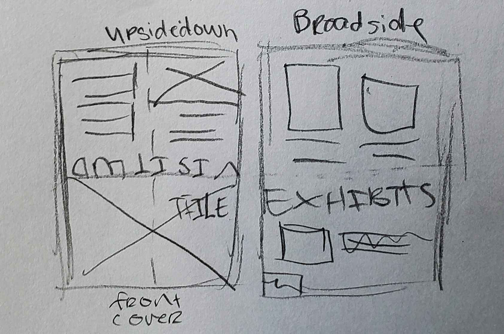
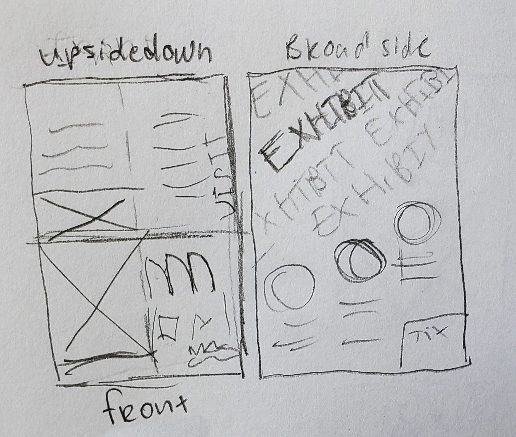
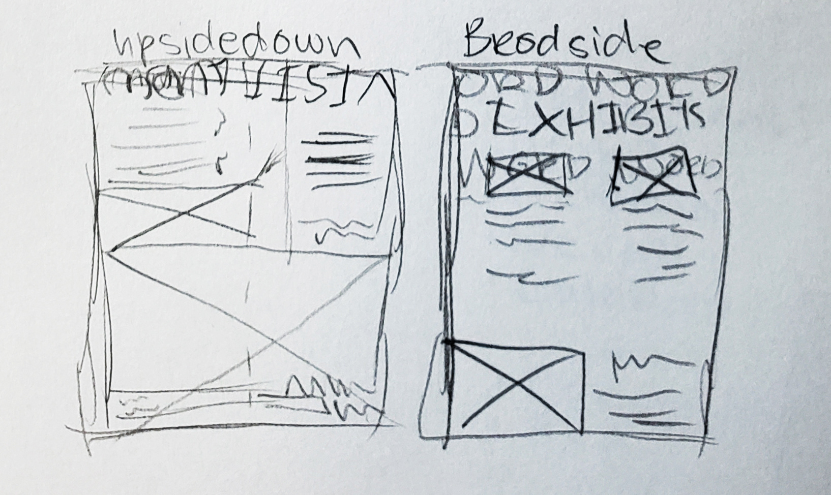
This project started with thorough research by visiting the website and learning about the museum and its unique style. Researching helped with the brainstorming session, where a list of the necessary information for the project formed. To allow inspiration to begin flowing, I researched images that I have the usage of rights for. The chosen photographs are used to grab the attention of readers with geometric shapes, contemporary work, and a pop of color. After the information and images were selected, thumbnails were created to develop a foundation for the layout. As I was looking at photographs of the exhibitions, a beautiful orange-yellow color popped out from the artwork and it worked nicely with the contemporary style of the website. At that moment, it was clear that the orange-yellow color would be the accent throughout the entirety of the brochure. After the colors, images, body copy, and layouts were thoroughly thought out, the project began to be pulled together.
Solution
An important aspect of the project was to create an alluring design to draw visitors’ attention. The geometric pattern of the museum steps is alluring, and the pop of yellow is enough to have the reader grab it from the brochure display. The secondary colors that complement the yellow are different shades of grey. With the bright yellow color, it was important that the secondary color chosen did not compete with the yellow in such a contemporary and straightforward layout. The shades of grey balanced the yellow out elegantly adding contrast. Putting the brochure together consisted of precise thought and a lot of detailed orientation. Alignment was a significant element that pulled the overall style of the pamphlet together. The imagery and other graphical elements had harmony; therefore, they worked together wonderfully. Every element had a purpose and was aesthetically pleasing to the readers' eyes. In the top half of the broadside page, words that described the museum were placed lightly in the background to add texture and interest to the page.
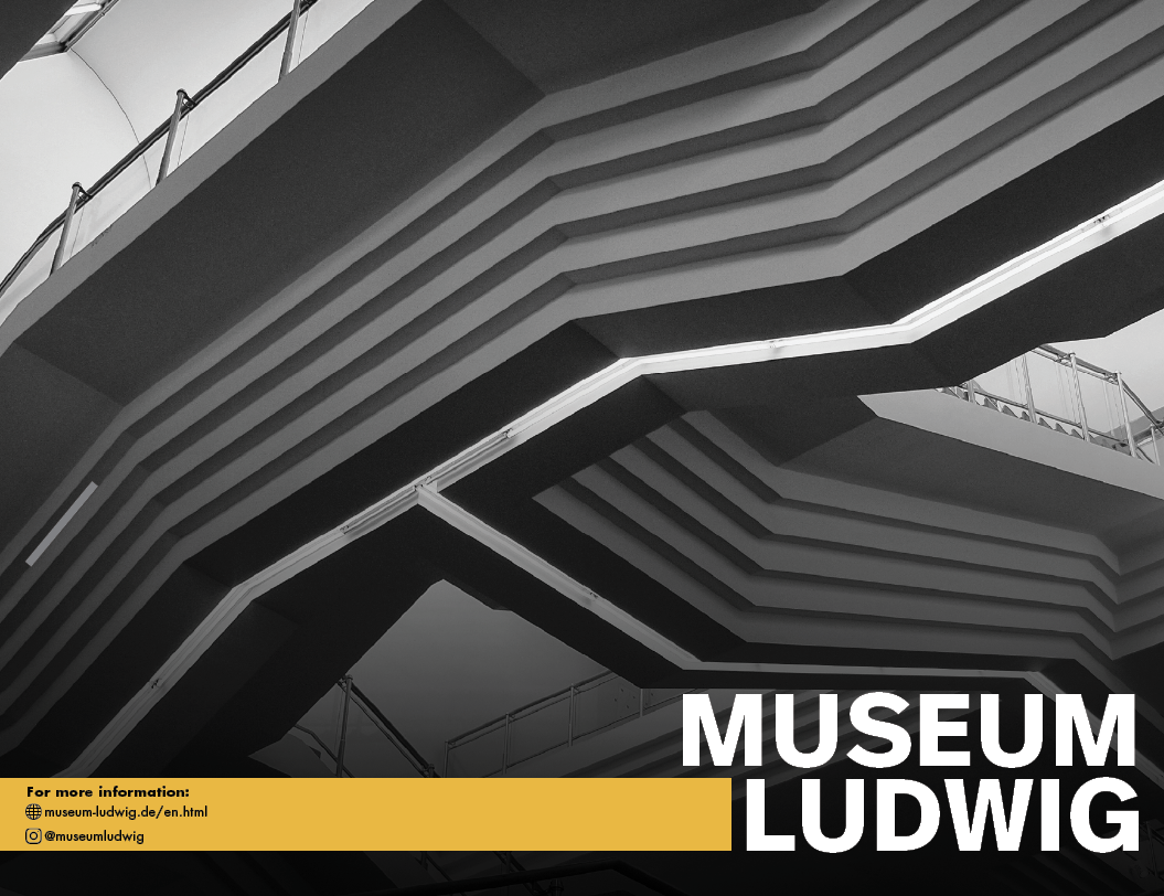
Front Cover
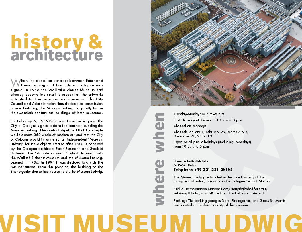
Inside
Challenges
Finding the copyright for the photographs was a challenge at the very beginning. The museum website has an abundant amount of information to read through. Another challenge faced was finding the perfect tone of yellow that would print out nicely. As yellows were test printed, they were hard to see or were too bright. The color was then adjusted by adding a small amount of orange. This treatment added richness to the color and was able to be printed correctly.
Conclusion
This project expanded my skills in layout design. Experimenting and learning the layout technicalities for an 8-page broadside brochure was a challenge but also enjoyable. Understanding which side had to be printed upside-down so that it could be folded to the correct orientation took some calculation. This project allowed me to expand my thinking in printing by considering bleed space, color theory, converting colors to CMYK, and basic printing knowledge. As I was able to be creative, there were technical specifications for the project that allowed me to practice working within parameters.
